
Operational visualisations
Show historical operational data on the RenewMap interactive map, including curtailment for projects and headroom for transmission lines.
Note: Curtailment and headroom visualisations are available as part of the Operational Insights licensed add-on. If you don’t have access, please ask your organisation’s admin to enable it.
Operational curtailment and headroom data is available to be displayed as a map visualisation, alongside charts in each project or line’s Operational tab.
How to view operational data on the map
-
Open the visualisation selector for Projects or Network.
-
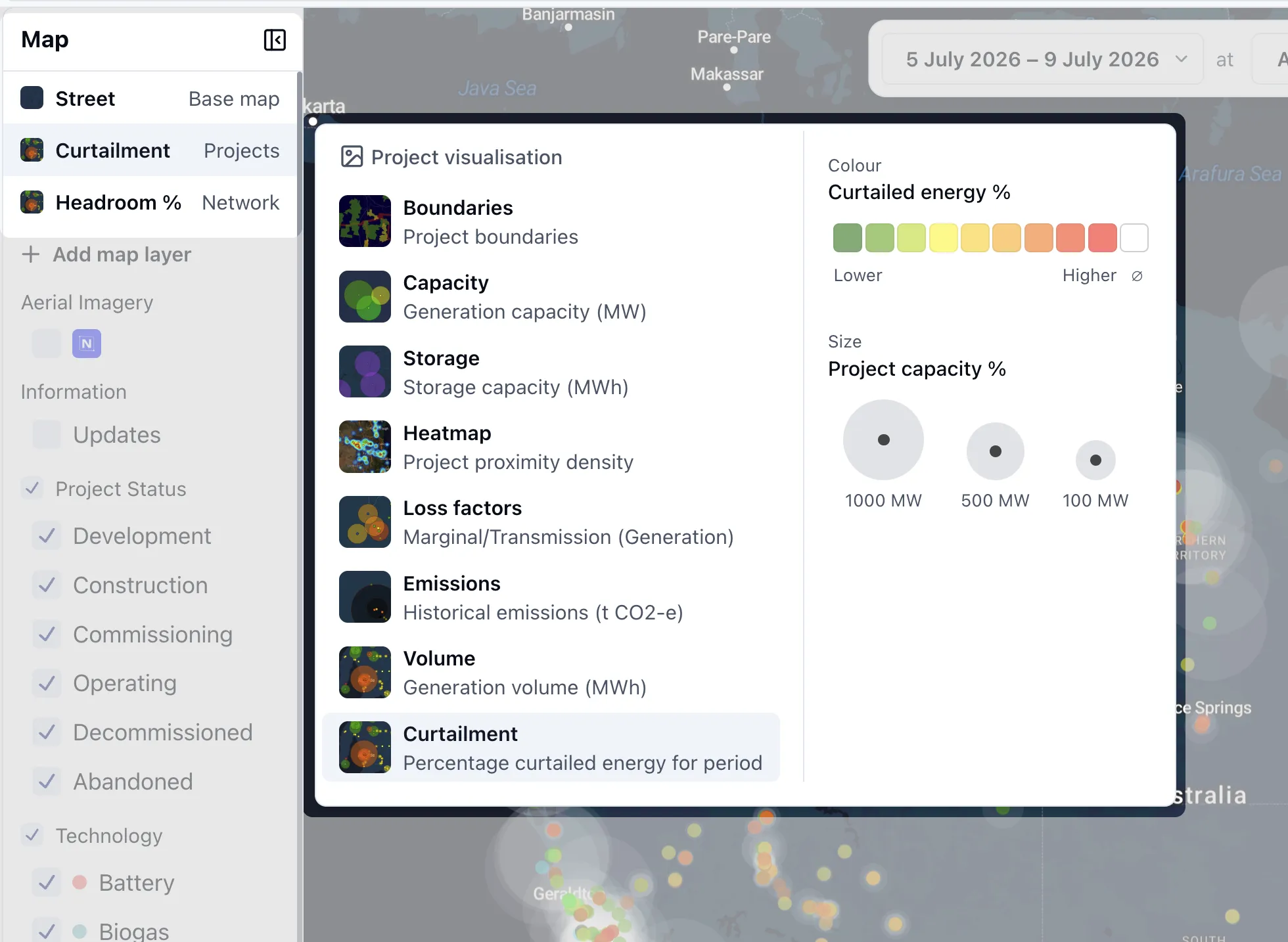
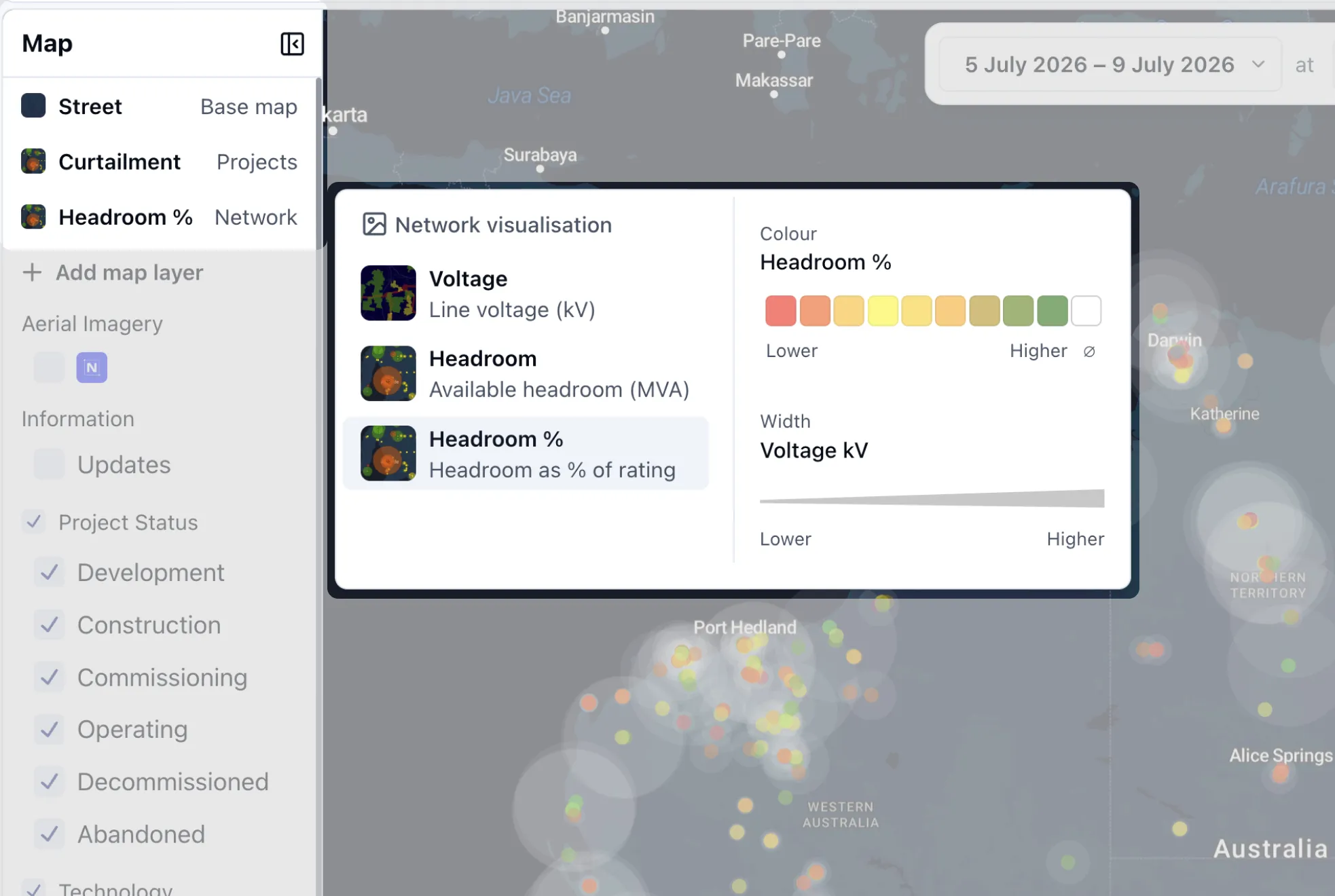
Select a timeseries visualisation:
-
Curtailment for projects, showing curtailed energy as a percentage.
-
Volume is currently available in base renewmap at yearly data only. This will be available in Operational Insights to show other time periods on the map.
-
Headroom for transmission lines, showing available thermal capacity either as a total (MVA) or % of the line rating.
-
-
The map colours or sizes each project or line based on the visualisation and the time range you’ve selected. Hover a project or line to see its value in the tooltip.
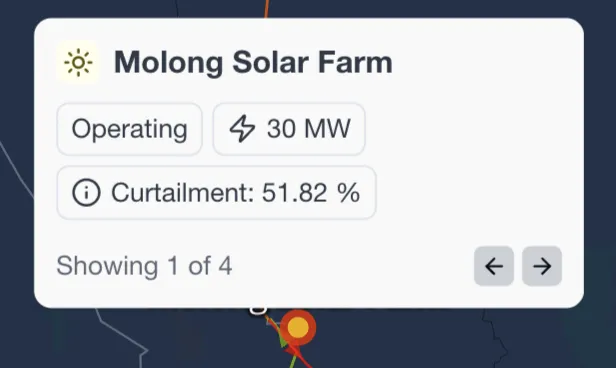
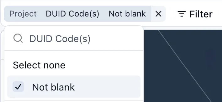
Tip: A curtailment visualisation only has values for operating projects with a DUID. You may want to filter to Operating projects with a DUID to reduce noise from projects with no data to show.
Click a project or line to see more data
Select a project or transmission line on the map to open its Operational tab, where you can see the underlying charts for the period you’ve selected.