
Operational tab
View curtailment, revenue, flow and headroom charts for a project or transmission line in RenewMap's Operational tab.
Note: The Operational tab is available as part of the Operational Insights licensed add-on. If you don’t have access, please ask your organisation’s admin to enable it.
The Operational tab contains operational data on Projects, Transmission Lines and Substations. To access this, select the entity on the map or in a table, then select the Operational tab in its side panel.
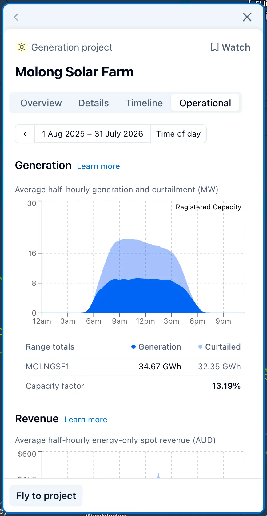
Top controls
The controls above the charts set the time period for every chart in the tab, and are synced with the global time picker, so changing one updates the map and the other too.
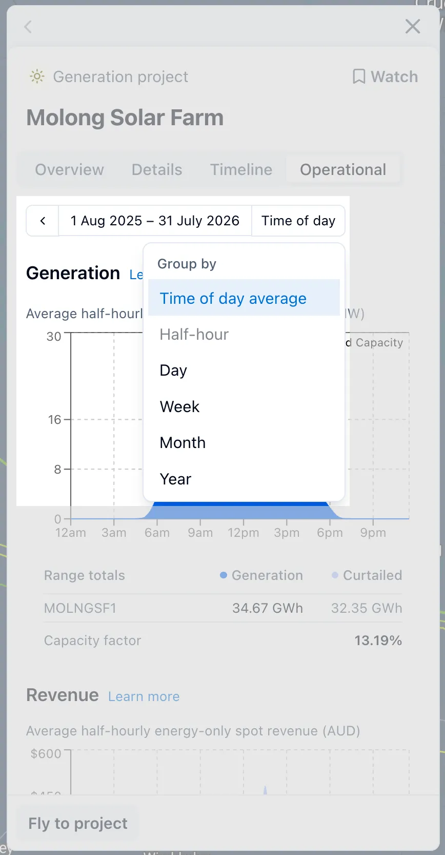
- Group by sets how values are grouped along the chart: Time of day average, or a fixed granularity like half-hour, day, week, month or year.
- Time of day average shows the average value for each time of day, based on all the data in your selected period. Choosing a granularity instead shows the actual value for each step across the period.
Reading the charts
Each chart shows one or more series over the selected time period. Click and drag across a chart to zoom into that period, or use the reset arrow to return to your original range.
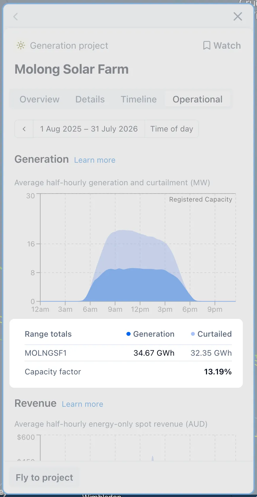
Below the chart, a summary section shows each series’ total or average for your selected period.
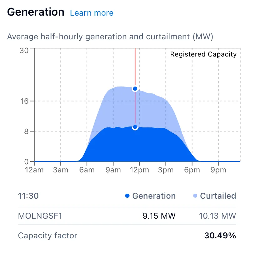
Hover a datapoint on the chart to see the summary switch to just that point’s values.
Project charts
-
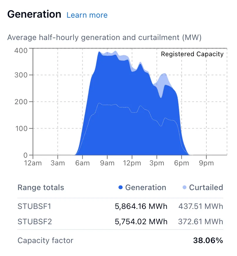
Generation shows dispatched output alongside curtailment, so you can see how much energy was curtailed against what was actually generated. For a project with more than one DUID, the summary table below the chart breaks generation and curtailment down into a row per DUID.
-
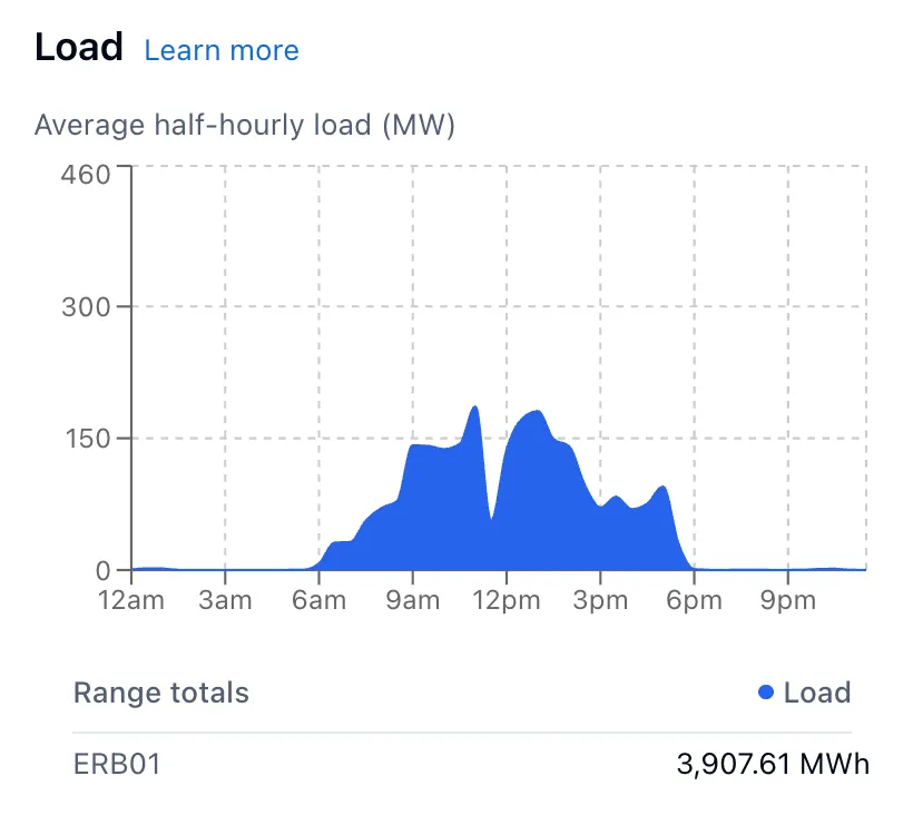
Load shows energy drawn from the grid, for battery projects only.
-
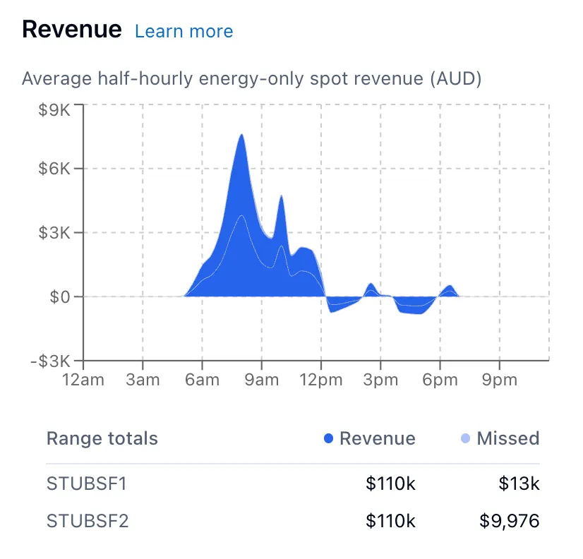
Revenue shows net spot revenue and missed revenue from curtailment.
Learn more about curtailment, generation and load and revenue and missed revenue.
Transmission line charts
-
Line flow shows power flow along the line, in two colours by direction. Red is the primary direction of flow (the direction the line carries power most of the time), and cyan is counter flow. Check the summary table below the chart to see which substation each colour is flowing towards. The chart shows flow in MVA where it’s available, and falls back to MW otherwise.
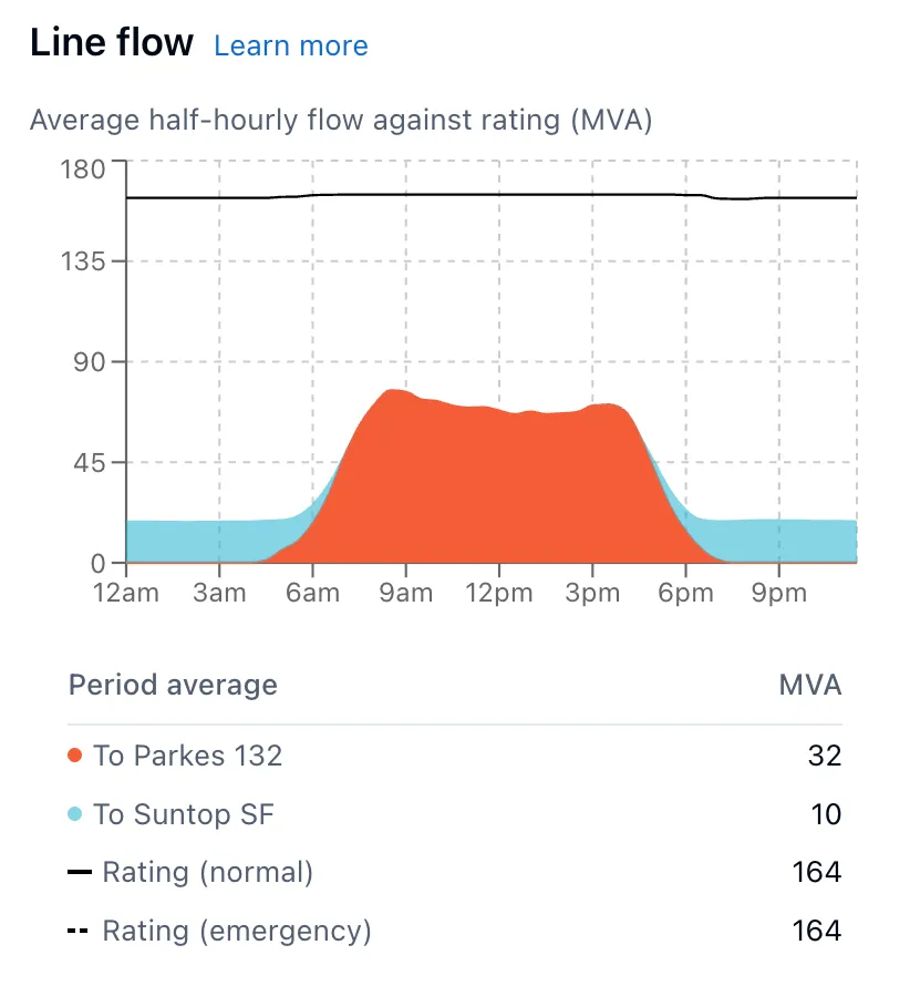
Note: When the Headroom operational visualisation is selected, flow direction is also shown on the map as animated chevrons travelling along the line.
-
Headroom shows available thermal capacity against the line’s rating, as a shaded area. The black line marks the line’s thermal rating, and the bold green line highlights any period where a network constraint pulled headroom below that. Like Line flow, it shows MVA where available and MW otherwise.
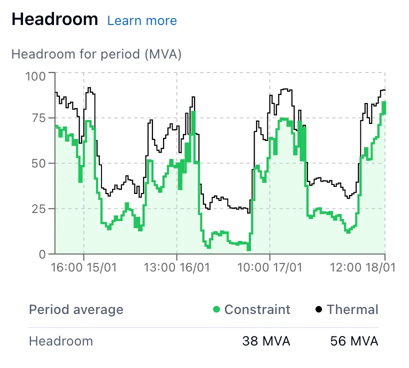
Learn more about line flow, ratings and thermal headroom and constrained headroom.