Beyond projects: how we model the A/NZ energy industry

Every one of the 4,000+ projects on RenewMap represents an achievement - not just for a single business, but for dozens. Doing work in the energy industry means navigating that network to find the right opportunities and partners.
That isn't easy. Knowing who to approach - and who brings the right experience to the table - often depends on existing relationships, adding friction and making it harder for newcomers to break in. So from day one, RenewMap has tracked the businesses behind each project, starting with developers and owners. But we were only seeing part of the picture. The broader ecosystem of technical advisers, contractors, financiers and equipment suppliers flows in and out across a project's lifecycle, shaping outcomes in ways that technical data and headline names alone can't capture.
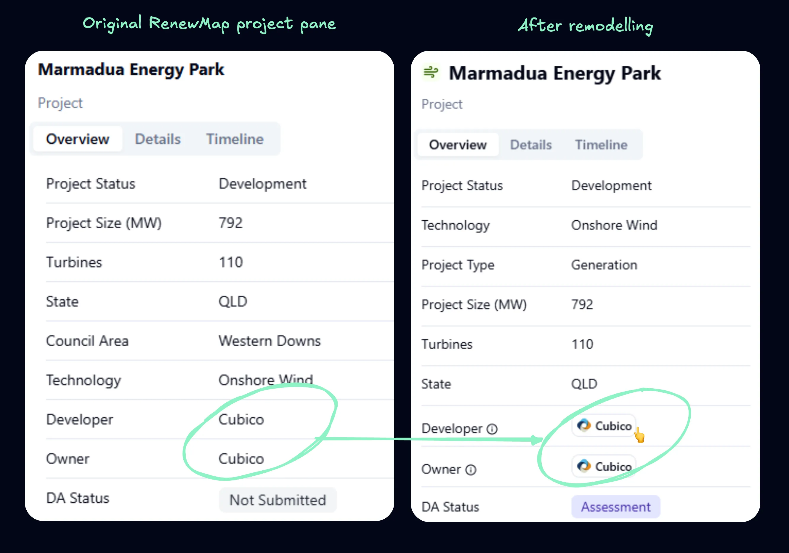
With our domain expertise and data foundations, we realised we were uniquely positioned to model that ecosystem properly - so we did. Now, organisations on RenewMap have evolved from simple text fields to complete entities. Our customers can search, click and filter by any organisation through the platform to see a full picture of their industry footprint.
This is part one of a two part blog series of blogs. Part one is about the technical challenge of modelling the ecosystem. Part two will explore some of the questions we, and our customers, are now able to answer.
Data engineering: rethinking the domain
When RenewMap started, we modelled the energy industry around projects and physical infrastructure such as networks and substations. Any organisations involved were stored simply as attributes on those records.
That worked, until one of our co-founders drove from Canberra to Newcastle thinking about the energy industry. He arrived with an insight: 'it's all related'. Every developer, owner, contractor, consultant, service provider, OEM, financier - each is part of a web of relationships that have real implications for how the energy industry functions.
At that point, we realised we needed to rethink our existing model.
To illustrate the problem we encountered, imagine a table of projects where developers are stored as an attribute, with values like:
| Project | Developer |
|---|---|
| Project Alpha | ACEN |
| Project Beta | Windlab |
| Project Gamma | ACEnergy |
| Project Delta | European Energy |
| Project Epsilon | ACEN, Windlab |
| Project Zeta | European Energy, ACEnergy |
Now ask a simple question: Which projects has ACEN been involved in?
You could search for rows containing "ACEN" - but now you've accidentally picked up ACEnergy as well. And with the risk of inconsistent naming, ordering, or punctuation, the problem compounds.
The solution was to elevate organisations to first class entities in the model. Beyond physical infrastructure and projects, we needed an 'organisation' layer of its own. Achieving this required a bit of effort.
- We got a list of every single mention of every organisation in our database - roughly 7,000 values
- We cleaned and standardised every one
- We created a canonical set of unique organisation records, each with its own identifier
Then came the question: what do we do with them? One option would be to simply replace the developer, owner or contractor values in each table with the new identifiers. That would solve the problem of blurry matches in querying.
However, modelling industry relationships as attributes on a table still felt too limiting. The energy industry is dynamic and evolving. Different organisations take on different roles throughout a project's life cycle, or across projects, and there are always new areas of expertise and involvement emerging as the technology changes. We also knew that many of our customers value relationship data as much as they value technical attributes.
We wanted a modelling approach that was both powerful and flexible, one that captured both organisations and their involvement in the industry, and made those connections visible throughout the platform.
Matching reality: relationships and graphs
When thinking about the future of market data in RenewMap, the model that immediately came to mind was a graph.
In data engineering, a graph isn't a chart or visualisation - it's a structure for modelling relationships.
You already interact with graph data every day, on social networks like LinkedIn, Facebook, and Instagram. These platforms are powerful not because of their user records alone, but because they model who is connected to whom, through relationships like follows, friends, and likes. Seeing connections lets us see how influence, trust, and opportunity flow through that network. And the energy industry is no different.
Where social platforms model personal relationships, energy has relationships like:
- develops
- owns
- consults
- contracts
- supplies
- connects
With even this small number of relationship types, you can model a graph like this:
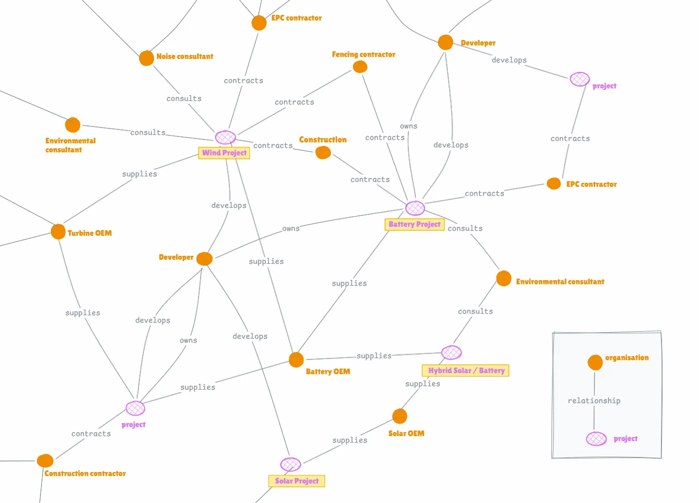
Graph data lets us model this reality directly. By surfacing relationships in the energy industry on RenewMap, we unlock value for our customers, and enable better transparency and information to drive a more efficient energy transition.
The RenewMap graph
Shifting to a graph data model has improved how we represent and query relationships. Instead of stitching tables together, we traverse connections directly, revealing patterns and collaborations with speed and precision. It also gives us the flexibility to add and configure relationship types, resulting in a more nuanced and accurate representation of the market.
And for customers, RenewMap now feels less like a database and more like navigating a professional network.
To describe the uplift in our capability, let's consider a user, Mark. Mark is a business development manager at a cabling supplier.
Mark uses RenewMap to track upcoming projects in his region. One day, he notices a project that has just received development approval. Naturally, he clicks through to learn more. In the past, the story would end there. We could show him the developer, and not much more. Now, that click is just the beginning.
Mark clicks on the developer and immediately sees their portfolio: 43 other projects, across nearly 4 GW of generation capacity. He can explore the developer portfolio in full - look at each project, check its development stage, fly to it on the map, and understand its physical footprint.
From there, he can see which EPC contractor has been engaged, which OEMs are involved, and which organisations have appeared repeatedly across successful developments. Every organisation is clickable and can be explored.
Peeking into the machine
Graph data unlocks a new type of analytics, over relationships and connectivity rather than more standard attribute aggregates. Now we, and our customers can ask better questions of the data. The RenewMap graph is in its nascent stages, but we can get unique insight from it already. I'll share some of the exciting questions I've been asking in part two of this post.
But to round out part one, lets have a look at what the RenewMap graph looks like today.
-
~13,000 entities (and growing)
- 4,000+ projects
- 2,000+ organisations
- 5,000+ network and substation geometries
- nearly 20,000 relationships modelled between all these things (and that's just the beginning!)
We currently model relationships across areas such as
- Developers and owners
- Contractors and EPCs
- OEMs and suppliers
- Connections between projects
- Hybrid projects and co-located assets
Driving this is a semi-automated backend that undergoes extensive human review. In an industry where projects take years and a significant amount of dollars, confidence in the data isn't optional - it's foundational. That's why we take the time to verify and research each relationship and datapoint before adding it to the database.
The result is a living view of the energy industry: portfolios at a glance, organisations aggregated and filtered in seconds, and real relationships brought to the surface. And we're only just getting started.
Click any organisation logo in RenewMap to explore - or hit the demo button below to see the graph in action.
In part two, we'll go a step further, using the graph to surface analytics and insights that simply weren't possible before.